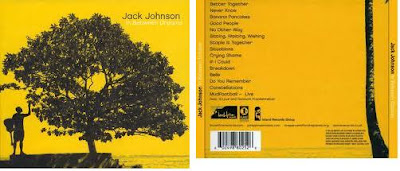
Wednesday 30 November 2011

[MP] Tour poster progress

30/11/11 Today I worked on my tour poster and have now finished. I used a range of techniques including colour picking to remove blue screen, fading the band members, and brushes to give the poster a full and complete look. 


This is my finished tour poster.


Monday 28 November 2011

[MP] Dunorlan Shoot Review

27/11/11 I went to Dunorlan Park to get some more footage that can be used to fill the gaps and progress the narrative throughout the video. The footage is of a walk all the way around the lake, following the path that the band members take in the narrative. The footage is all point of view (POV), which adds another type of shot to our cache.


Friday 25 November 2011

[JB] Editing Example 28/11/11


This is an example of time manipulation. It is used to either speed up or slow down a clip for a variety of purposes, such as dramatic effect, resitricted time, changing scene, emphasis, reversal or simply aesthetic.

In our case we used it to reverse the clip so that it played backwards, adding to the quirky feel of our video.

[DF] Print Ad Progress

This is a template for our print ad. We will add the picture once we have taken it and alter the image accordingly, adding further effects to make the photo look as good and fitting as possible. We intend to have the band standing upright in the middle of the ad, as demonstrated by the stickmen.

Wednesday 23 November 2011

[DF] Editing Example 23/11/11


The editing techniques used here are image control and brightness and contrast settings. These allow us to alter aspects of the image such as hue, saturation, brightness and contrast. By doing this, we can change the mood or the tone of the film, or simply bring out colours more.

In this case specifically we changed the settings in order to bring out the colour of the T-shirts, making them more vivid and prominent in the shot. The image also looked somewhat grey and washed, so we also did it to make it look more colourful and lively.

The shot itself is a long shot of the band standing on a set of outside stairs. This is part of a stop motion sequence in which jump cuts are used as the band descends. We wanted the most stand-out part of the shot to be the coloured T-shirts, as they move around with each consecutive step.

[MP] Tour Poster Update

After looking at other tour posters, we have revised the layout of the tour poster, which will give the band more prominance by being placed at the top of the page.

An example of a tour poster

Also, the font size of the text underneath sets up a hierachy of importance, with the band name at the top, followed by what is happening (UK tour) and lastly the cities which will be played to.


Tuesday 22 November 2011

[DF] Editing Example 22/11/11


This screenshot is an example of one of the most common editing techniques - cutting. This involves splitting a clip at a defined location allowing the editor to move and manipulate the two parts of the clip separately. This is especially helpful in our video as our performance were filmed as a series of one shot playthroughs (we played through the song with the camera constantly rolling and moving), and this allowed us to split it up into the parts we want which we can then interpose with our non-performance footage as we see fit.

In this case, we are splitting up a clip which moves from the close-up of the bass seen here to a mid shot of the drummer and finally to a mid shot of the lead singer and back again.

The shot itself is a close-up of the bassist's hands as he plays, with shallow focus on the guitar and strings. We used the blue colour and tone throughout the performance.

[MP] Print Development

This is the mock up for the tour poster part of the printwork that must be undertaken. The large font of the band name and the fact of a debut tour connote importance, whilst the cities that will be played taking third place in importance behind the image of the band.


This is the current state of the tour poster printwork. At present I have used the text feature although this is not the font that will be used. The band will be shown behind the text (which will not be black) in their colourful t-shirts, perhaps on the steps in Dunorlan park that feature at the start of the music video.


[JB] Feedback from Rough Cut

Today, Group 1 Productions presented a rough cut of our music video to the rest of the class. We gained some insightful feedback as to how we could improve our video, and what direction we should be taking as of today.

Generally, the feedback was that we need to simply place more footage onto the timeline. At the moment, we have been held up by a series of technological difficulties which have hindered our progress, and as a result of this we deem it necessary to put in any extra hours we can to catch up. It is necessary for the timeline to be filled up to at least 50% by the end of our Thursday lesson, so that we can gain further feedback as to how the footage could be rearranged and placed in a better layout.

It wasn't all negative feedback, however; we were informed that the colours in our performance shots - as well as the framing of them - worked very well. We received constructive criticism which suggested that we include more guitar performance shots.

We discussed the possibilities of us placing some of our Brighton reccie footage onto the timeline to see how it would work in context with the other locations. We will attempt this and review it.
We may even use chroma-keying as a technique to place this footage behind some of the performance shots, and experiment with such possibilities.

On my Friday afternoon I intend to visit Dunorlan Park again to carry out some point-of-view filming of the paths and the park in general, to give us further footage to work with on the timeline.

[JB] Deconstruction of Advertisement


Genre
How is the genre of the track/artist evident?
The genre of the track is not inherently evident in this print media. The only possible indicators of the genre could be the font used for ‘The Killers’ at the top of the page and the blue wash over the whole image. Perhaps the ram with the cloth over the top of it could indicate some sort of indie genre because it is ‘standing out from the norm’ and as such representing the artist/genre by postmodernistic means.
Media Language
What visual techniques are used?
The image used to fill the advert has a blue wash over it, changing the tone of the image and therefore giving it a completely different feel. The band’s logo is in very prominent and contrasting red font, to make the words stand out on the advert. It is made the most prominent in the image in order to control the reading path of the consumer of the advert; they initially read “The Killers”, then see the ram and then acknowledge that it has a cloth over it. It is deliberately structured in this manner to control what the consumer of the advert thinks about when they see it. They see the band name first so that anything they see they consequently relate it back to that artist, and thus contributing to the star image.
How is meaning generated through these techniques?
The image is so surreal that it has no particular meaning inherently obvious attached to it. However, the fact that it is surreal perhaps represents the band in a postmodernistic manner, because they stand out compared to other artists and as such conform with Dyer’s paradoxes to some extent, making them ‘extraordinary’. Also note that an image of the band itself is not included in the advert, making them ‘absent’ according to these paradoxes.
What linguistic devices have been used?
The only linguistic devices which have been used in this advert are simply the band name, single name and extra information along the bottom of the page. This minimizes any influence on the meaning of the image and leaves it down to the audience to interpret the advert in their own way.
Is there any intertextuality or references to popular culture?
The only intertextuality is the references in the smaller wording at the bottom of the page, referring to the release date of the track and where it is available for purchase.
Representation
How is the artist represented?
The artist is represented in somewhat a postmodern and ‘different’ manner, because instead of using an image of themselves they have used one of a ram with a cloth over the top of it. People generally don’t understand why this ram has the cloth over it’s head and therefore this encourages them to engage in the track and/or music video to accompany it to find out more.
Institution and Audience
How might this print text be consumed?
This advert was found in a music magazine. This means it is placed in context with other adverts and there is lots of competition with other, similar bands who feature in the magazine, since the magazine is likely to only feature music tied in with one or a few specific genres.
The fact that it is in a magazine, which people have gone out and bought, means that these people are likely to be considered ‘active’ consumers. This means they are likely to want to engage in synergistic media associated with the track, and thus if they see an advert which is very enigmatic such as this, they are more likely to actively engage.

[JB] Deconstruction of Digipak


Genre
How is the genre of the track/artist evident?
The digipak design is evident of the alternative rock genre. The visual elements of the image are representative of the rebellious culture of rock. Grenades are seen as rebellious because of their violent and dangerous connotations, and this grenade is being held up in the air by a fist - a sign of success, or maybe some sort of uprising, which is again representative of the rebelliousness. The grenade is also in the shape of a heart, which connotes love. The blood dripping from the grenade, however, could be connoting some sort of violence or inappreciation of life. It shows that the hand has just torn this heart from a living being.
Media Language
What visual techniques are used? (rule of thirds, texture, colour, tone, mise-en-scene)
How is meaning generated through these techniques? (semiotics)
What linguistic devices have been used? (look at emotive language, use of quotations, connotations of song/album title)
Is there any intertextuality/references to popular culture? How does this create meaning for the audience? Think about postmodernism here, use of parody, pastiche.
This digipak follows perhaps one of the most conventional rules of graphic design - the rule of thirds. The arm and clenchefist design is most prominent at the heart/grenade, and this point lies on one of the thirds. There is a perfect amount of space to the left of the grenade for the artist name and the title of the album. The reading path of this illustration is as follows: the eye first looks straight at the heart, then the blood on the heart, then the fact that it is in a clenched fist, then the realisation that the heart is a grenade, followed by looking at the large white writing in the top left saying “Green Day”. The artist’s name is written in very bold white capitals so they contrast with the background and stand out as very prominent. They are intentionally the next thing that the viewer sees after the illustration of the grenade, so that people understand who the album has been produced by.
Representation
How are the band/artist represented? Does this add to their ‘meta-narrative’ in any way? How does it help sell their product?
Here, the artist is not shown directly on the cover. In terms of Dyer’s Paradoxes, the stars are absent rather than present, meaning they conform to the paradoxes only to some extent. The only presence of the artist is the bold white writing saying “Green Day”.
Institution and Audience
How might this print text be consumed? How is this evident in the way it is constructed?
This design is for use on a digipak, which will generally be on sale in a record shop such as HMV. It is designed to stand out as much as possible in comparison to the other CDs on the shelf and does so by having a very simplistic design which is easily recognisable and thus associated with the artist.

Monday 21 November 2011

[JB] Progress 21/11/11


This lesson we have progressed in editing our video and creating our print work. We have decided on the general layout of our advert and tour poster as well as the fonts we will be using, outlined in another post. The layouts are posted below:


[insert scans]

[MP] Fonts for Printwork

We have been looking at fonts on dafont.com, and these are the two that we have shortlisted.

Friday 18 November 2011

[DF] Print Ad Progress


This is my first rough draft of the print ad. It outlined the basic layout and style that I want, with the picture in the background that will be in vivid colour, the four band members standing up straight wearing the T-shirts and the text in that kind of font.

Thursday 17 November 2011

[DF] Print Ad Deconstruction


Print Ad for Placebo's single 'Meds'


Genre
How is the genre of the track/artist evident?
The band and album are generally placed in the alternative rock genre. This album in particular saw an increased use of synthesisers and keyboards and focused on a much more 'back-to-basics' approach. This is evident in the print ad through the simplistic use of negative space, clear, simple font and an enigmatic image.

Media Language
What visual techniques are used?
The image in the centre right is most prominent and makes use of layering and rotating/flipping as well as negative colour and transparency to portray an enigmatic depiction. The surrounding black negative space helps to emphasise the image and perhaps add to a sinister feeling.

The font is bold and simple, and is sized according to a hierarchy of importance and intended impact. The band name and album name are the largest, with information about the single in smaller font below, a review below that and finally a selection of tour dates. The band name is also coloured green to further emphasise it in the otherwise black and white content.

How is meaning generated through these techniques?
The meaning behind these images is purposely obscured  by the use of colour, negative space and indescript font. However, there is a certain sinister feel generated by the dark colours and negative, layered, transparent image. The image also fits in with the album thematically. The lead singer and guitarist has said: 'I think there's a lot of songs...about the dangers and effects of drinking' and the layered image appears to show sad, potentially damaged people and this could link in with the dangers of drinking.

The green colour of the font spelling 'Placebo' is used to emphasise the band and anchor the image around them.

What linguistic devices have been used?
The word 'meds' implies a deterioration of health and this paints a bleak picture as the backdrop of the album and print. Similar associations are formed with the band name 'placebo'. A review is also used on the print ad to shape the consumer's opinion by using the comments of a highly well-known music magazine - NME. The review itself says 'the masterpiece they've always promised to make' and this creates a sense of anticipation and a sense of 'this is what you've been waiting for' in its language.

Is there any intertextuality or references to popular culture?
The only intertextuality which appears to be present is the mention of NME to validate the positive review and make the consumer more inclined to side with the opinion presented.

Representation
How is the artist represented?
The artist is represented as dark, serious and enigmatic. This is done partly through the use of colour, but also in no small way through Dyer's paradoxes. The artist is seen as present through the inclusion and emphasis of their name, and yet absent in their actual photographic absence in the image. The damaged and sad state of the layer people make it somewhat relatable and ordinary, however the negative colour distances it, making it simultaneously extraordinary. It is through this that an incoherent and incomplete image is formed.

Institution and Audience
How might this print text be consumed?
This print ad was featured in a music magazine. This means that its consumers are likely to be interested and more likely to be active consumers. It is also featured alongside other advertisements, meaning it is in competition for audience attention. This may be the reason for the enigmatic style of the image, as it raises questions in the consumer's mind demanding that they buy the product and find their answers. The black negative space is also fairly atypical and plentiful, making the black eye-catching on the page itself.  

[DF] Drama Studio Shooting Analysis 16/11/11

In the afternoon on the 16th of November we filmed our performance aspect of our music video. This involved myself as the drummer, Matt Passmore as the bassist, Harri Mulley as the guitarist, Henry Newsome as the lead singer and James Bedwell as the camerman. This is the same cast and team as our Dunorlan trips to continue the band image.

In filming we had only a few specific shots in mind, perferring instead to get a plethora of shots which we can choose from depending on which make the most sense in editing. We made sure, however, that we got certain kinds of shots, such as close-ups of the lead singer, shots looking down the neck of the guitar, etc. We did this by playing through the song many times with our cameraman walking around getting shots as he saw fit, reviewing the footage after each playthrough.

The only difficulties we incurred were that the drum kit we wanted to use was in use and unavailible, and so we had to compromise, and we only had one camera. The single camera didn't allow us to get the kind of shots we wanted in one performance, and so we had to perform multiple times getting different kinds of shots each time.

Tuesday 15 November 2011

[DF] Editing Issues

Unfortunately we have been having issues with editing recently which has hindered our progress. Over the course of the past three lessons we have experienced problems of corrupt files, Adobe Premier crashes, external hard drive malfunctions and difficulties adding video clips.

We have been working with the teachers and technicians to resolve the problems so we should be back on track very soon.

Monday 14 November 2011

[MP] Technical Analysis of Advertisement

The Charlatans Forever. The Singles.


Genre
The alternative rock genre of the artist is evident in this advert, with the messy hair and neutral if slightly contempt looks on the faces of the band members. This has connotations of being a rebellious youth and not conforming to mainstream society. 


Furthermore the band members are in black and white with the contrast turned up to max. This doesn't give a particularly glossy look, contributing to the imperfect style of the genre.


Media Language
The rule of thirds is not followed entirely by this advert. The title of the album is placed in the top left corner but I feel that it is too small and insignificant to be a strong start for the dominant reading path. The lead singer is centred on the upper third line and is larger than the rest of the band members which gives him dominance on the page and placing the start of the reading path with him. The path then moves straight downwards to the smallest figure on the advertisement. Although the size of an image on a page often determines how obvious it is, this figure is set in proud contrast to the white space around him giving the eye a new point to move onto. The reading path now ends in the bottom left corner with the detail of the album contained in a large lump of text. This reading path is quite abnormal, and continues to further the alternative rock metanarrative of the band.


On another point, the text is presented in white, creating a strong contrast to the black upon which it is placed. This does increase the importance of the text in the advert somewhat, as it is obviously needed to let the audience know what the album is. The album title is also at the top of the page, awarding it more importance than the contents of the album, which are detailed at the bottom of the page.


The album title 'The Charlatans Forever. The Singles.' shows that the album is an amalgamation of their singles onto a one album. Singles albums are released once a band has been around for a long time. The extra word 'Forever' on the end of the band name implies perhaps that they may not be recording any more music or are breaking up but still wish that they are remembered by their fans.


Representation
The band are here represented as impulsive, contemptuous people. The looks on their faces seem to look down at the audience slightly, placing them with a higher power than the audience. The sudden splashes of colour give their impulsive side, set in sudden opposition to the black and white advert. In Dyer's terms, the band is present in this advert. This ensures that the audience have an image of the band for consumption and for the continuation of completion of the bands' image. On the other side, the band are also absent by being edited into black and white with excessive contrast. This removes a lot of detail from the faces of the band members giving incoherence to their image. 
Institution and Audience
This advert would be consumed through the EMI magazine as this is where it was obtained. However it would also be consumed in high street shops and on the internet, as it is the image used for the front cover of the album that it is advertising. The image would also become familiar to the audience in this way, reinforcing the association of the image with the band.  

[DF] Digipak Ideas

In researching ideas for our digipak I have come across a few interesting ideas.


Maritime - We, The Vehicles
This is the cover the album which our chosen song is from. I feel it is important to see how the band present themselves, before we do so. It is interesting that it uses a variety of colours, as does our video, however these colours are slightly washed.

[DF] Dunorlan Shoot 12/11/11

Our shoot was not as successful as we hoped. We planned to get the band in the performance and get some shots of walking around in plain T-shirts to fill the narrative, however our lead singer could not be present due to familial matters. This meant we had to improvise a few shots, however it was impossible to get what we wanted and so another shoot will be needed, which we plan to undertake sometime afterschool within the next week, as well as our performance.

Thursday 10 November 2011

[JB] Animatic

A2 Animatic


This is our storyboard animatic for our music video. It was helpful in the planning stage however our concept has changed several times since then and so it is not as relevant now. Despite this, it was helpful to find out an idea of how many shots we needed, of what kind and how to spread out performance and narrative. It was also helpful to see how we should distribute long shots, close-ups, extreme close-ups, etc.

[DF] Concept Development 10/11/11

We have spent this lesson finishing our animatic as well as planning our next shoots. We plan to shoot the rest of our Dunorlan footage on Saturday, and the performance on Wednesday.

Friday 4 November 2011

[MP] Performance Location

For our performance, we are thinking of filming at a factory unit in Tonbridge, as the large brick walls will give a good backdrop fitting in with the DIY indie conventions. To be able to film on the site, permission had to be attained, and is shown here.


[MP] Lighting Techniques Video

A great video to show some simple lighting techniques that have great affect on the look of the shot.

Thursday 3 November 2011

[MP] Presenting pitch for greenlight

At AS we had to merge all of our research into a single presentation. used Prezi to present our pitch to the class. This was new to us, so we were not able to make proper use of all of Prezi's features.

During our pitch the main obstacle that we encountered was with our concept. Our initial idea of using a house as our primary location was flawed, as we would have had to clear the rooms we wanted to use and reconstruct them to fit into our film opening. Also, the use of a house location would not help with keeping our product in the horror genre. To continue, we had not used Prezi very much, meaning that our presentation did not use all of Prezi's features.

For the A2, we had had much more practise and experience with using Prezi, and this turned
out to be a great asset, giving us much more creative leeway. The main improvement with Prezi is that it is much better for presenting the creative process that is the creation of our music video.  

Our pitch was very useful in the final development of our concept, as points were raised that we had not seen ourselves. This has given us the chance to solve problems that have arisen, and alter anything that needs it. This will ensure that our concept is as finalised as it can be before we start production which will help us to create a good music video.
From here, we will act upon the points that have been made to us by altering our ideas to improve on our concept. Locations will be finalised, along with our concept and narrative ideas.

[DF] Film Shoot 1 Analysis

27/10/11, Dunorlan Park
Dom Ford, James Bedwell, Matt Passmore, Harri Mulley and Andrew Mitchell.


We had our first shoot in which we aimed to get as much of the footage for the narrative as we could, in spite of the last-minute absence of our lead singer due to familial constraints. This meant that we had to alter some of our ideas slightly to allow for more separation of the band members within the video to allow us to film with only three of the band and one extra. The rain posed another problem, which meant that we had to think more carefully about the safety of our equipment and the look of our shots, although this was short-lived. For our next shoots, it will be important to keep in mind the time constraints of the clocks moving backwards, meaning it will get darker earlier. We also need to take into account how long it will take us to get the footage we need.

Wednesday 2 November 2011

[MP] New location for performance

We have been discussing ideas for new locations to do our performance, and quite like the idea of a brickwall backdrop, perhaps an outside wall of a factory. We would have to ask permission and make sure we weren't in the way of any traffic, but there seems not to be any other obstacles. Also, it would rule out the possibility of civilians getting in the way as they could do if we filmed in a town.

[MP] Performance Filming

Today we had a proper look at setting up in the drama studio. We have a lighting technician on board to help, but the problem is the backdrop. There is a stage entrance for performances, but this isnt something we want at all. Unfortunately we cant change this. The green screen we had planned to use isn't big enough, and neither is the blue screen. They are also different sizes, so they can't be put together. 
We are presently discussing alternative locations. 

[DF] Digipak Deconstruction


Digipak Deconstruction
Jack Johnson – ‘In Between Dreams’


Genre
How is the genre of the track/artist evident?
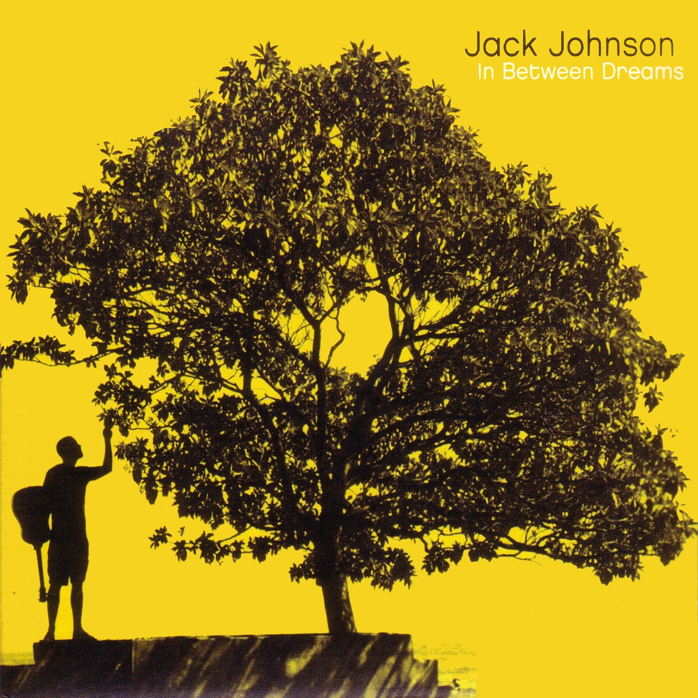
Jack Johnson is a folk-rock singer-songwriter from Hawaii. The genre is known for its use of acoustic guitar, which is evident on the album artwork as one is slung over his back. It is also known for its warm, calm feel which is portrayed by the orange/yellow and black colour scheme.

Media Language
What visual techniques are used?
The rule of thirds is used and broken in this digipak. On the front, the artist is in the lower left third, the platform takes up two thirds of the bottom third line and the artist and album name is in the upper right third. However, the tree, which could be said to be the focal point, is in the centre of the picture, with the leaves spreading to both left and right thirds of the picture. On the back, the tree trunk is positioned in the right third while the track listings are in the left third.


In terms of a colour there are only two main colours present. The background is a warm orange/yellow (a very gentle gradient going from a more yellow shade in the bottom left to a more orange shade in the top right), whilst everything else (the tree, the artist and the text) is black, with the exception of the album name which is white. This creates a silhouette effect.


On the front cover, the actual subject being depicted is the artist in shorts with an acoustic guitar slung over his back looking up and grabbing a leaf of the tree which takes up the majority of the picture, leaving negative space only in the bottom right and top left corners.

How is meaning generated through these techniques?
Using Roland Barthessemiotics we can see that these visual techniques are signs used to create meaning. The rule of thirds is generally used to create an aesthetically pleasing picture, however breaking it with the overbearing tree may be a suggestion of the correspondingly overbearing power of nature. Similarly, the act of the artist grabbing the tree could imply a certain harmony between man and the natural world.

The connotations of that orange/yellow shade in the background are mainly of the sunset, which could be a suggestion of the album’s sonic atmosphere. Similarly, the colours are warm, ‘friendly’ colours which are aesthetically pleasing.

The tree is the main focal point of the picture, and this suggests several things. Firstly, that nature (often symbolised by a tree) is central to life. Similarly, trees are symbols for life and health and so this could also create the meaning that nature is central to human life.

What linguistic devices have been used?
The artist’s name – Jack Johnson – is alliteration which makes it sound more pleasing to say, and as well as this the forename and surname are both quite common, and therefore more relatable to consumers.

The album is called ‘In Between Dreams’. The most obvious connotation of this is sleep and dreams (pleasant, as opposed to their negative counterparts – nightmares). This generates a relaxed and welcoming feel. There is also a possible visual play on the words, with white being used exclusively for the album title, and, as such, is ‘in between’ the black and yellow colours.

Is there any intertextuality or references to popular culture?
There are certainly no explicit intertextual references; however the tree could be a reference to many things, such as the Tree of Knowledge in the Garden of Eden. This may suggest that human life as we know it is contingent on the tree, and thus suggests a certain harmony between man and nature.

Representation
How is the artist represented?
The artist is represented as a warm, welcoming, chilled-out acoustic guitarist. This is a continuation of Jack Johnson’s metanarrative in that these are all traits he has consistently been attributed from his previous albums.

In terms of Richard Dyer’s paradoxes (‘Stars’, 1998) the artist could be said to be present in that he is shown on the cover, and yet absent by the colour scheme making him a silhouette. Similarly, the acoustic guitar and shorts makes him seem ordinary and relatable to the audience, however the colour scheme again, as well as the enigmatic location, causes him to seem simultaneously extraordinary. This creates an incomplete and incoherent star image.

Institution and Audience
How might this print text be consumed?
This text will be consumed primarily through advertisement – seeing the digipak on a shop shelf, in a television advert, on the internet, etc. This is evident through the use of Dyer’s paradoxes. These paradoxes create an enigmatic, incomplete and incoherent star image that makes the customer want to buy the album in order to answer questions raised by it. Similarly, the digipak advertises the songs inside and on the front displays the artist’s name and the album name, so that people may recognise the artist and want to buy it.

Tuesday 1 November 2011

[MP] Next filming trip

The majority of our performance will be filmed tomorrow on wednesday 2/11/11 in the drama studio, utilising a double free after lunch and time after school. This will give us a 4-5 hour block which will mean that we can set up and film for a decent period of time.