Monday 9 January 2012
Monday 12 December 2011
[MP] Evaluation (4)
- We used blogger.com as a collaborative e-portfolio in our group throughout the planning, construction and evaluation. For example, primary research that was carried out was uploaded to the blog, where all members of our group could comment and add their own research. Also, deconstructions and secondary research could be conducted on blogger. Using web 2.0 meant that we could embed videos to our blog, upload photos and add links to other websites.
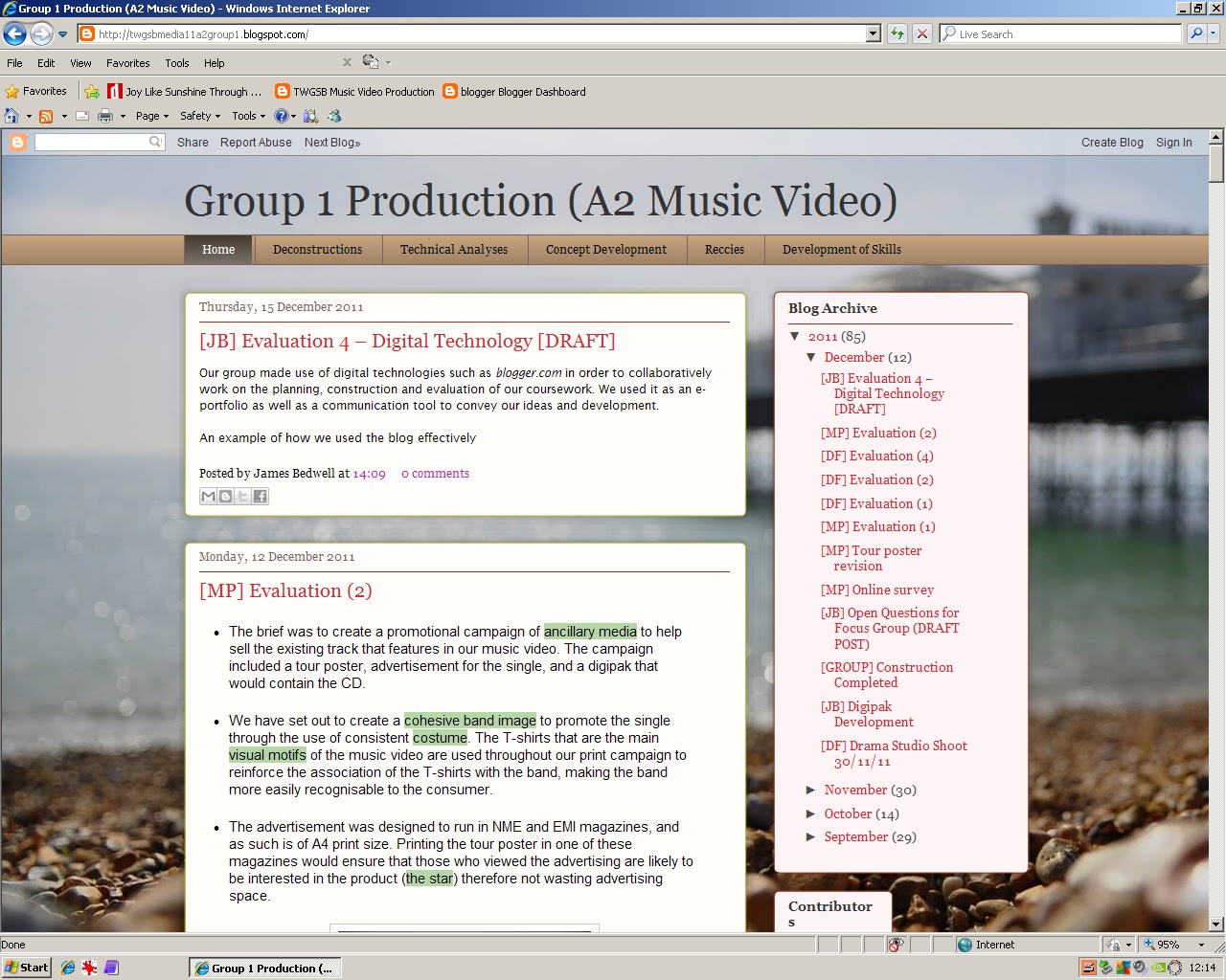
Our blog at first glance
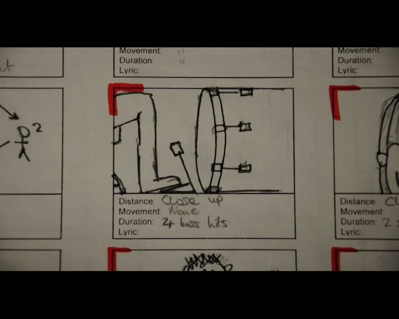
- Using Adobe Premiere 9.0, we constructed an animatic by importing close-up stills of our storyboard onto the timeline and then cutting them at the rate that we would use for our video. This gave us a good idea of how much footage we would actually need, and the different varieties that would be needed to keep the video exciting.
 A still from the animatic
 - When shooting we used a Nikon DSLR, which gave us footage of a much higher quality than we could have achieved with the school cameras. The challenges that had to be overcome include the main problem of Dom Ford and I learning how to use the camera properly. The main teaching point was how to use the manual focus properly, which meant that we could select our focus points very finely, giving us the ability to ‘pull-focus’, a technique that is currently very popular in the media world. Keeping the camera safe in rain was another problem, which was overcome with the utilisation of coats. Other than these issues, filming progressed smoothly.

Nikon D90
- To edit the video, we used Adobe Premiere 9.0. The main techniques that we used were cutting in sync with the music which was mainly used for our stop motion sequences. These were synced in time by zooming in and matching the cuts to the peaks in the audio image, ensuring that cuts would match to the bass drum or the snare drum. Image control was also used to adjust the colours of the footage, increasing saturation to give fuller colours and emphasise the visual hook of the 'parade of punk rock T-shirts.
- Adobe Photoshop was used to create the ancillary media, which included the adverts and the digipak. The main feature used was layering, where images, text and brushes are layered up in order on a background, which means that many parts can be used in the printwork. Also, colour removal was used for the photos of the band, which were taken in front of a blue screen. Because the blue screen is a very flat colour, it can be removed in photoshop, leaving only the image of the person behind.
- Our audience research was created on SurveyMonkey.com, and then posted onto the social site Facebook. The link was posted to friends specifically as opposed to setting the link as a status. This meant that people would be much more likely to answer the survey, and this method gave us a total of 31 respondants in 3 days.
[MP] Evaluation (2)
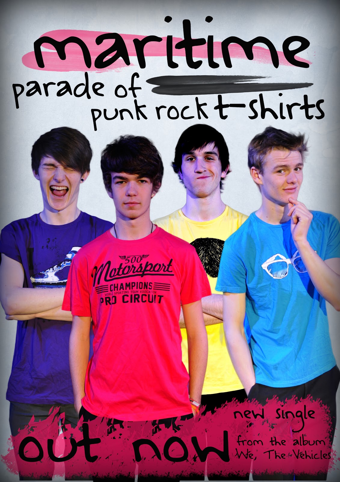
- The brief was to create a promotional campaign of ancillary media to help sell the existing track that features in our music video. The campaign included a tour poster, advertisement for the single, and a digipak that would contain the CD.
- We have set out to create a cohesive band image to promote the single through the use of consistent costume. The T-shirts that are the main visual motifs of the music video are used throughout our print campaign to reinforce the association of the T-shirts with the band, making the band more easily recognisable to the consumer.
- The advertisement was designed to run in NME and EMI magazines, and as such is of A4 print size. Printing the tour poster in one of these magazines would ensure that those who viewed the advertising are likely to be interested in the product (the star) therefore not wasting advertising space.

The finished tour poster
- The text anchors the image of the band by being set across their middles, effectively tying the band to the page. This focusses the consumers’ attention on the centre of the page, continuing to reinforce the association of the T-shirts with the band.
- All of the texts link to the video through the T-shirts. These are the consistency throughout the entire campaign and the main link to the band. The font is also used throughout the promotional campaign, acting as a secondary method of tying the campaign together under a cohesive image.

Digipak
- By using Dyer’s critical framework (Stars, 1998) on the construct of the star image, it is evident that the band conforms to his two essential paradoxes of being a star. Initially, the band is present, by featuring on all of the prints. However, they are also absent in the way that they are only shown in one pose each, meaning that they are only presented to the consumer as they are on the print – the consumer can only learn a small amount about them. The band is also shown to be ordinary in their costume being effectively ‘plain-clothes’, although their costume is a pivotal feature of this campaign. Also, their hair and expressions are not overly extravagant. The band is shown to be extra-ordinary simply by being on a poster. This honour is given to a very small proportion of the population, and the position is highly idolised by the general public.
Sunday 11 December 2011
[JB] Evaluation (4)
- Our group made use of digital technologies such as blogger.com in order to collaboratively work on the planning, construction and evaluation of our coursework. We used it as an e-portfolio as well as a communication tool to convey our ideas and development.
- It helped our planning because it allowed us to document our research and to understand how certain theories and conventions may be appropriate for our video. It aided in construction by allowing us to keep track of our progress and meet deadlines, as well as to post feedback, for example for the rough cut.
- At times, the blog was seen as more of a hinderance than a help - however, last year we used the blog for our AS production of a film opening, and now that we have had a second opportunity at a blog it has proved more helpful.
 |
| Our Year 12 blog. |
- We produced an animatic of our music video before we began the construction. This animatic was useful to us - it allowed us to see just how much footage we would need, as well as whether it would actually fit with the structure we had chosen for it, and what sections would require changes to the types of clips we chose.
- The use of ICT helped us to reach an audience for planning and evaluative purposes. We carried out a closed questionnaire on a website known as SurveyMonkey, to which we posted a link on social networks such as Facebook, for access by our friends who were of the age bracket and target audience we were aiming for.

- We also uploaded our music video to YouTube, and shared the link on Facebook, enabling us to get a few more views than anticipated and thus receiving more feedback than we had perhaps initially expected.
- I used Adobe Photoshop CS5 in order to design and create a four-pane digipak design as part of the promotional campaign for ‘Parade of punk-rock t-shirts’. This is a very versatile image creation and processing program which allowed me to create varying effects on certain visual elements of the design.
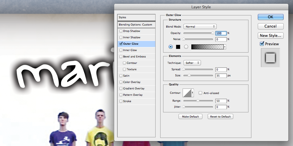 |
| Layer Styles dialogue box |
- For example, I used the Layer Styles dialogue box in order to create a soft black outer glow on the text layers. This makes the font much more readable and also gives it a very professional, clean look.
- I also used the Cutout filter in order to apply an artistic effect to the images of each band member. This further increases the “professional” feel which is achieved from it because it removes any blemishes from their faces.
- To film, we used my Nikon D90. It is a Digital SLR camera, which has a much larger lens than the standard HD camcorders available, and this resulted in a much higher level of clarity in our footage and brought out a lot more detail.
 |
| Nikon D90 |
- Adobe Premiere 9 was the program of choice for editing our music video. With a similar principle to Photoshop, it is a versatile tool to manipulate our footage into a working, final cut.
- We used certain techniques in our video to achieve interesting effects on the footage, to give it a professional feel.
- One technique we used was cutting. This allows us to shorten the footage we took into useable size, and into the specific length of time that we want each individual clip to be.
- Another technique we used was Image Control. This tool allowed us to modify the hue, saturation, brightness and contrast of our footage. We used it on our performance shots to greatly improve the appearance and professionality of it.
[DF] Evaluation (4)
- We used Blogger as a host for our academic blog throughout the planning, construction and evaluation stages. Blogger is an example of Web 2.0 which has had a massive impact on the media, as it allows democratisation since potential directors, authors and musicians can more easily and cheaply get their work published and advertised. A key part in this, and what makes Web 2.0 what it is, is greater interaction between the consumer and the web and its content. Similarly, pluralisation is a result of Web 2.0 – a media landscape in which people can more freely choose between a wider range of sources.
 |
| Our blog. |
- In order to plan promotional campaign we used a variety of different methods, all recorded on the blog as we went so that we could easily refer to it at a later date. We began with secondary research – watching music videos from our chosen genre, and these we analysed in multiple ways.
- One way was a deconstruction of a music video, and later deconstructions of print advertisements. This helped up in finding out many of the things which make up these texts, and how they add meaning or affect the consumer. We also carried out technical analyses of music videos. For this we took a set of notes regarding camera techniques, duration and action of each shot in a music video. This helped us to see how many shots we really needed, what the distribution and proportion of different camera angles and shots should be to keep it interesting and also how the narrative/concept and performance should be distributed throughout the video.
- Using Adobe Premier 9, we used our storyboard to construct an animatic. Due to us changing our concept a few times during the planning, our animatic was not explicitly useful on our actual shoot, as we felt more comfortable deciding what shots we wanted on location, due to the nature of our concept. However, the storyboard and animatic were useful in gaining experience in planning out our video, and testing out concepts in a way which allowed us to get a glimpse of what the final product may look like.
- When shooting, we used a DSLR camera, allowing us to take high-quality footage and photographs, as well as change the lens easily (we used a fisheye lens for some footage), zoom quickly and smoothly and alter the focus manually. We had very few issues with the camera, however it was important for us to plan and prepare for a potential dead battery mid shoot, for which we simply brought spares, and to make sure everyone filming knew how to use it properly and keep it safe.
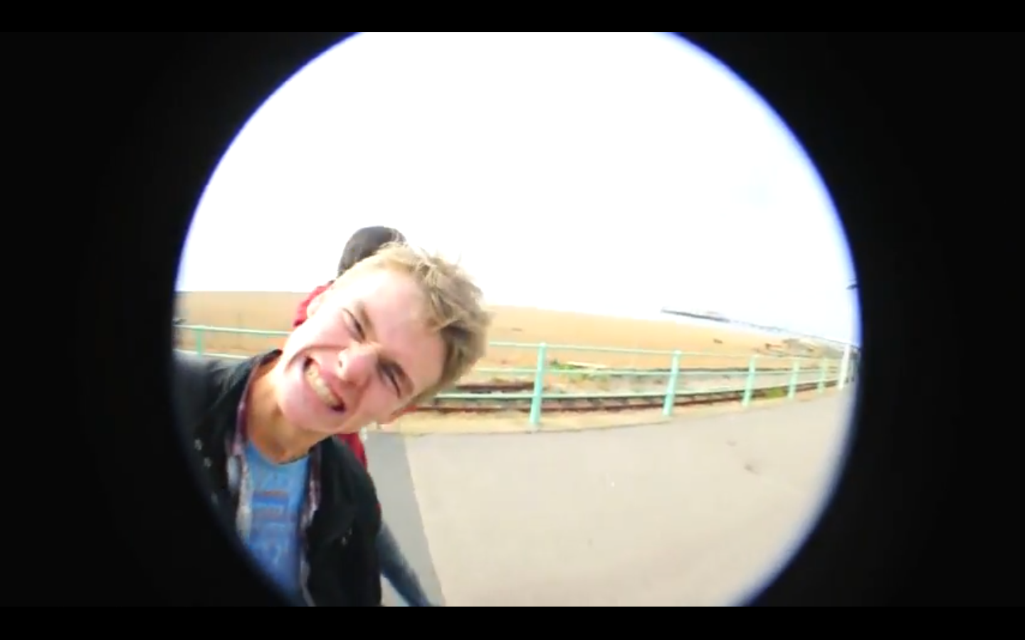 |
| A shot using a fisheye lens. |
- To edit the video, we used Adobe Premier 9. Some key techniques we used with this software were time stretch, which allowed us to slow down, speed up or reverse clips. We used this at various points in the video for several purposes, such as keeping the clip in tempo with the song, making a previously uninteresting shot quirky or to reuse a clip in a different way.
- Another technique we used was image control, which allowed us to alter the brightness, contrast, saturation and hue of a clip. We used this primarily to bring out the colour of the T-shirts more and in general make the colours a bit more vivid and less washed. Precise cutting was also crucial to our production.
- Many segments of the video were stop motion from clips, or two clips which needed to look like one continuous shot. In order to do this and make it look interesting and believable, we needed to use the cutting tool very precisely by zooming far in and using multiple timelines to line them up.
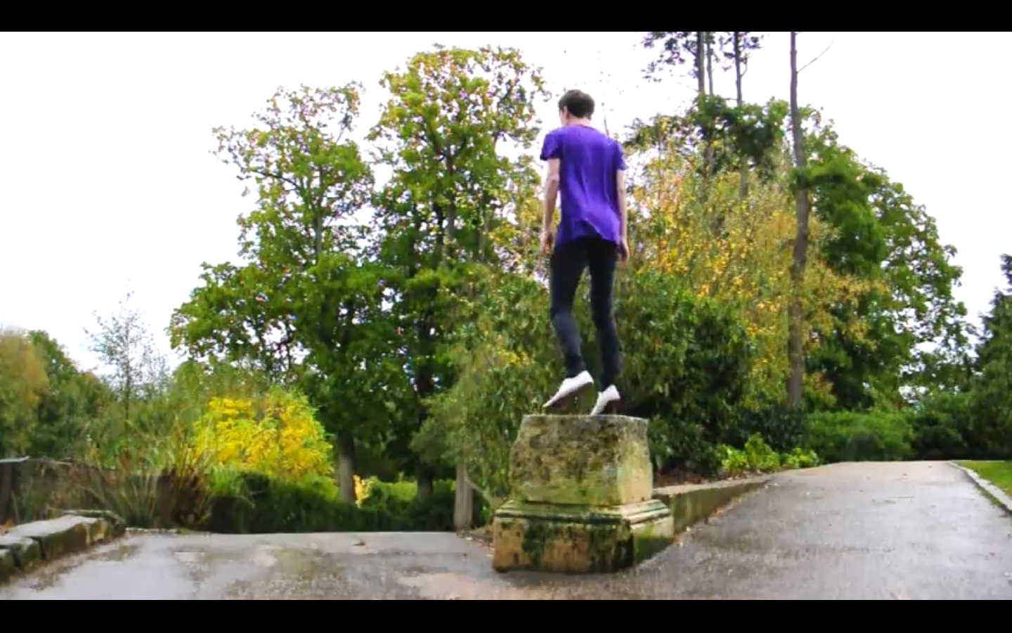

Two separate clips edited to appear as one consecutive clip in which the T-shirt changes mid-shot and mid-jump.
- In Adobe Photoshop, we created our print works. The main functions of Photoshop we used were layering, image control, cropping and brushes. We used layering in order to place many images over one another, and order them how we wanted with the ability to reorder them if we needed. Image control was necessary to fix issues with lighting between the different images, for example with one cropped image having the light source from a different angle than another. We used cropping to move our images from our blue screen background onto our main canvas. Brushes were also used in order to make the background a bit more busy with less negative space, which we found detracted from the image.
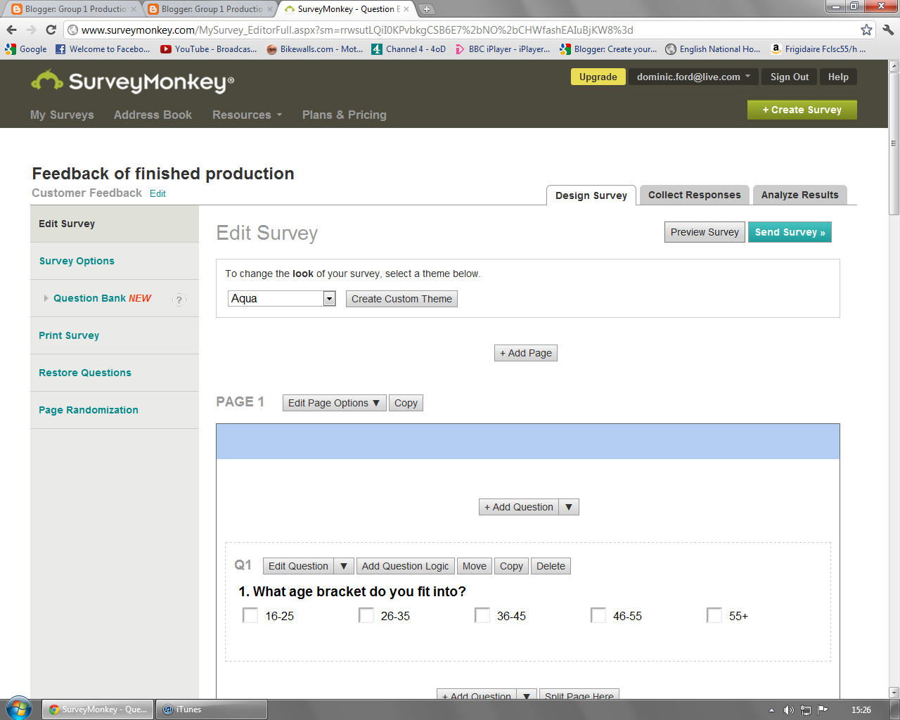
- Our audience research was carried out in two main ways: online surveys through Survey Monkey and focus groups. Our online surveys were used when we wanted a larger response. We found that these were useful for closed questions, however the open questions were a bit too susceptible to non-serious answers, as a result of the anonymity granted by the internet. Our focus groups (such as our first concept pitch) were much more useful in gaining answers for open questions.
 |
| A survey to gain feedback for the finished music video. |
[GROUP] Evaluation (3)
- Our post production audience research was conducted in two ways. A quantitative survey was created using surveymonkey.com, giving us quantitive data by means of ranked, scaled and semantic differential questions.
- This was posted on the social network Facebook as our target audience spends a large portion of their free time online meaning that this method would be most likely to obtain numerous responses. 31 responses were gained in total, all within the target audience age bracket of 16-25, 77% of whom were male and 23% were female.
- The primary target audience for the single is 16-25 year old males, with females of the same age group coming in a close second. We felt that the older generations would not relate to the postmodern ideologies that the band associate with and that are displayed throughout the video.
- Our methodology in doing previous surveys had been slightly flawed. Because they were conducted over the internet, the anonymity unfortunately allowed less serious responses. This issue was seen most in the open responses, but there were also a couple of problems with people giving non-serious answers on the semantic differential and closed questions. However, after filtering these out (and being careful not to remove any responses which were simply negative rather than non-serious), the results from our post-production survey gave us useful answers with which we can evaluate our work proficiently.
- The survey results are embedded from slideboom.com below.
Matt Passmore
- The second method used to collect audience feedback used open questions that were asked to a focus group of students. This gave us qualitative data as the focus group could answer however they liked. [Link to Open Questions]
- The focus group consisted of 12 male students all within the 16-25 age bracket that makes up our primary audience. A limitation to our focus group was that there were no female students present, restricting the opinions to the male mind.
- The answers were filmed, and the response video is embedded below from Youtube.
- We are planning on filming an amount of our narrative in Dunorlan Park as we feel that this location will give us a lot of opportunity to shoot interesting footage. We already have some footage from Brighton that could be used in our production.
- The issue that was raised was that we would have to find out how well the footage from Brighton will integrate with footage from Dunorlan Park.
- To find this out we will do a location reccie to Dunorlan Park and edit a short length of film so that we can assess the result.
- The performance part of our narrative is to be filmed in the drama studio that has a full lighting rig. We will need to try out the lights to see what different effects can be achieved, and what looks good on screen.
- We are also thinking about using a green screen, and this is another piece of equipment that will need to be tested to see if it is worth spending the time editing the raw footage that contains the green screen.
James Bedwell
- We tested our print works throughout production by printing off mock-ups and rough copies and then asking members of our target audience and our teachers what they thought of them and how they might be improved.
- From this, we changed many aspects of our print work, such as the lighting effects on the photographs (originally it looked like there were two different light sources for two different photos), the brush we used for one part and the placement of the text.
- These external and objective viewings we therefore highly useful, as it is easy to get caught up in your own work and miss some aspects which a first-time viewer would pick up.
 |
| Group 1's print ad. The brush at the bottom underlying 'out now' was originally different, and the placement of 'parade of punk rock t-shirts' was changed due to feedback. |
We presented our pitch to the class, another media studies teacher and a temporary technician on 10th October. We gained the ‘green light’ with a number of issues suggested that will need to be sorted before we start filming our music video production.
[JB] Evaluation (2)
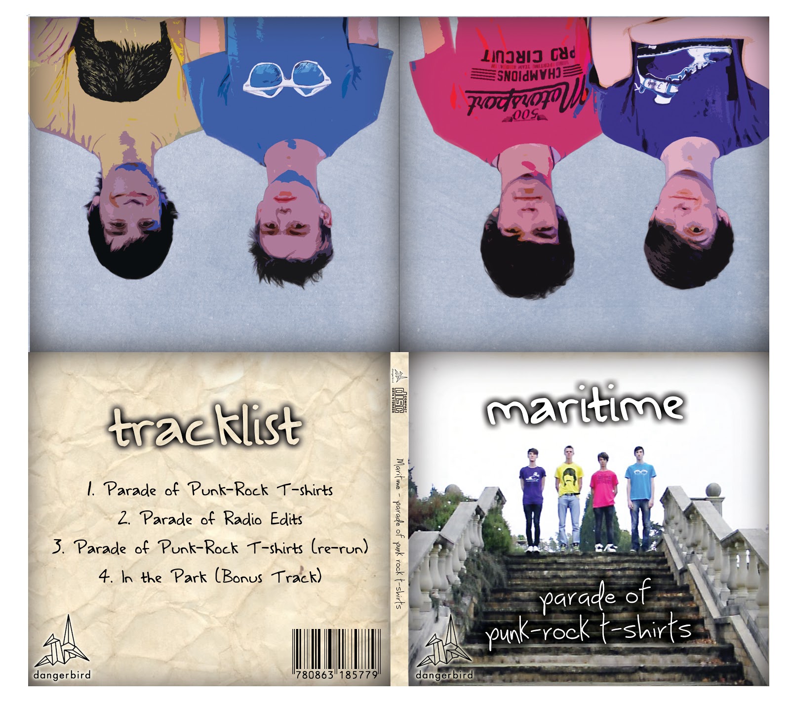
- The brief was to create a marketing campaign to promote a new track. This included a music video, a digipak, a magazine advertisement and a tour poster.
 |
| Digipak |
- We have created cross-media convergence and synergy between our music video and all of our ancillary texts. Our four-pane digipak, the full-page magazine advertisement and the tour poster are all reminiscent of each other and the video.
|
| Tour Poster |
- We intended to create a strong brand image for our band. The main aim of the music video is to act as a means of promotion for the song, but also to contribute to the star image. In combination with the ancillary texts we produced, we have created an all-rounded image for the band, which represents them in a youthful, energetic manner.
- We created a few visual links between all of our print medias so they could all be recognized as being produced for the same track. For example, we used the same fonts across all of them, as well as the same background textures and colours. Another very strong visual link - common not only to our print medias but to our music video as well - is the colorful t-shirts which all band members wear. This reinforces the consumers’ association of the t-shirts with the band because they are across all media and are present wherever the band itself is present.
|
| Advertisement |
- We used the tour poster and full-page magazine advertisement to give the impression of a successful artist, and contribute to the star image. With reference to Dyer’s critical framework (Stars, 1998), this means they are represented to be extraordinary due to their success, thus making them idolized by the audience - yet they are also shown to be ordinary by the way they dress. Semiotics and visual motifs all work together to represent them in a somewhat ordinary way, so that the audience can associate with them. They are also present because they all feature on the cover of the album, but absent to a limited extent because they are at a distance and do not take up much of it. They are also only seen in one pose, so the consumer sees somewhat a limited view of them, meaning they are absent.
- The digipak was designed to be aesthetically pleasing and employs the rule of thirds and negative space to create a design which looks not only pleasing but also professional. The front cover features a still from the music video, with the band members on the steps with their colorful t-shirts on. It uses the same font for the word ‘maritime’ as the other print medias do, creating cross-media convergence, however the track name ‘parade of punk-rock t-shirts’ is in a font which is perhaps more appropriate for this media because it makes the title much more readable and distinguishable.
[DF] Evaluation (2)
- Our brief was to create a promotional campaign for an existing track which did not already have one. We did this through the main product of the music video, as well as the ancillary products – the print ad, digipak and tour poster.
- Throughout our print work we aimed to create a cohesive band image which would serve to not only promote the artist and track in question, but to also link all parts of the campaign through visual motifs so that they are all recognisable and are associated with each other. This creates a stronger and more persuasive image in the audience’s mind.
-
- Our print ad would most likely be found in magazines which cater to the genre of music Maritime play, such as NME or Q. This targeted advertising would ensure that our promotional material would not be wasted on those with no interest in the genre.
 |
| Group 1's digipak. |
- We chose to design an A4 page advertisement. Although more expensive in magazines, it would stand out far more prominently and would really help to get the somewhat unknown band out there. We also felt that an A4 page fitted best with our design ideas as we planned to use images of the band standing up straight, which may not come across so well on a half or quarter page advertisement.
- Our use of visual motifs reinforce the band image across all ancillary products, making sure that the audience knows on first sight which music video and song the print ad, tour poster and digipak are related to.
-
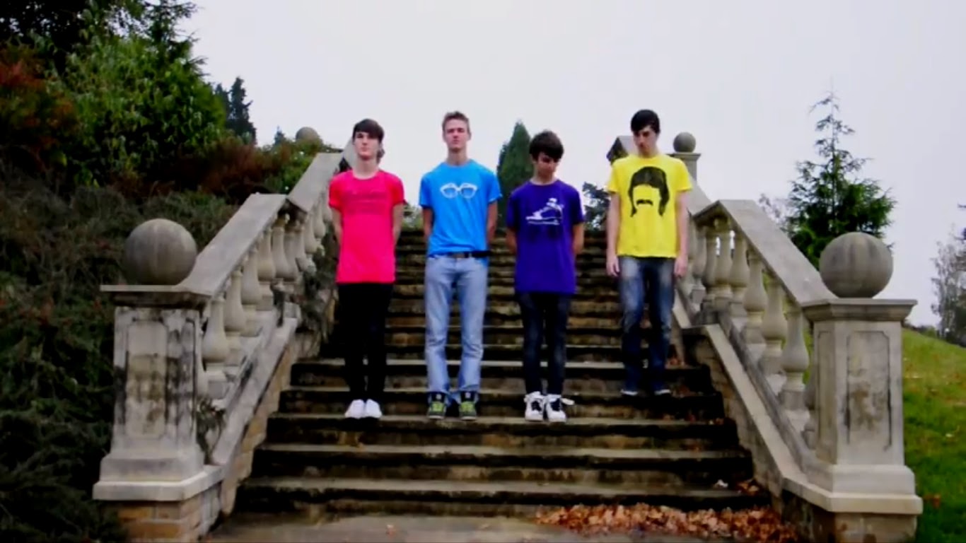
- Some visual motifs we used included the font, which we kept the same for the band name across all products as well as for the text in the video, the image of the band members standing upright facing the camera (for interesting variation, the faces and actions changed, but the stance and T-shirts remained the same), which also creates a first-person mode of address, engaging more with the audience, and the background texture between the print ad and the tour poster. These all serve to associate the different parts of the campaign together, and to reinforce the band image in the consumer’s mind.
|
| Group 1's print ad. The coloured T-shirts are a recognisable visual motif. |
- The text anchors the image of the band, making it clear that they are Maritime, and are the same people from the video.
- Using Richard Dyer’s critical framework on the construct of the star image (Stars, 1998), we can see that his two paradoxes (an incoherent and enigmatic star image is created by the artist being simultaneously ordinary and extraordinary, and absent and present) are fulfilled in our print texts. The artist is present in all three by the inclusion of their photographs. However, they are made to be absent by the fact that their whole body is not visible, and on the digipak a cutout effect is used. Similarly, the artist is made to be ordinary by their ordinary expressions and T-shirts, however they are seen to be extraordinary in the digipak by the cutout effect.
[JB] Evaluation (1)
- Goodwin’s critical framework (Dancing In The Distraction Factory, 1993) shows us that there are certain aspects of videos which are recurrent across all genres of music video, and our video is no exception - our video conforms to these genres. It has a strong link between the music and visuals.
- A music video is a tool to promote the song and artist it is made for. For this reason, the visuals are constructed around the song, rather than vice-versa. There are certain points during our video where this applies; stop animation is used for a playful effect, and in most occurrences each new frame is carefully synced in time with the beats and tempo of the soundtrack, thus conforming with conventions of the form.
- There are also points during the performance section of our video where we show lip syncing and syncing with instruments. This gives the video an ‘authentic’ feel because it makes it seem like the band is playing the music in the video itself as opposed to just on a soundtrack which has been placed over it. This, alongside the stop animation, shows that there is a strong link between the music and visuals.

- Another point to note is that the lip syncing is illustrated by use of close-ups and so-called ‘meat shots’ (close-ups of the singer’s face and mouth — often making use of a first person mode of address, although this is absent in our production). This conforms with the idea of a music video, because the close-ups used help to show the artist to the audience and thus, when they are represented through use of semiotics, it constructs a star image for them.
- We chose to feature a variety of shot types in our video, ranging from extreme close-ups to extreme long shots. We mostly used close-ups in our performance shots, to show the band to the audience, and we used long shots in our narrative where it seemed much more appropriate - and where there was more of a need to convey the narrative, rather than the people acting in this narrative.

- It is important to note that, although the vast majority of music videos feature heavily with the use of first person mode of address, it is subtly absent from our production. Rather, the artist appears to be addressing an unseen audience, within the fourth wall.
- There is a relationship between lyrics and visuals. Our production takes heavy influence from the song name ‘Parade of punk rock t-shirts’ and the lyrics which feature in this song. In our video can be seen people wearing plain white t-shirts and not having much fun, contrasted with many clips of the same people but in very bright and expressive t-shirts.
- Another particularly prominent set of links between the lyrics and visuals are the points at which these lyrics actually appear on screen during the performance shots, as seen at precisely 0:40 in the clip below.
- In our production we aimed to achieve narrative fuzz to some extent - we hoped that by having a narrative which was not necessarily illustrative of the lyrics we would create a captivating & more enigmatic video in which the audience would like to continually engage, and view in a focused way.
- The video reinforces the dominant ideology that the youth of today enjoy having a lot of fun. The nature and tone of the video is lighthearted fun which is illustrative of this ideology, as it shows the band members enjoying themselves.
[DF] Evaluation (1)
- Using Goodwin’s critical framework (Dancing In The Distraction Factory, 1993), it is clear that our video conforms to many of the characteristics which are prevalent in the genre and many of the techniques which are used in music videos to generate a star image.
- The genre of our track, ‘Parade of Punk Rock T-Shirts’ by Maritime, is indie rock. Characteristic of the genre musically are catchy lyrics and melodies, a relaxed or light-hearted tone and quirky or interesting aspects in some way (for example, an unusual vocal technique). The music videos for indie rock tracks are extremely varied, and tend to be anything from pure performance videos such as Maritime’s only other video for their song ‘Paraphernalia’ (Poltermann, 2011), to fun mixes of performance and narrative fuzz, for example in fun.’s video for their song ‘All The Pretty Girls’ (Director unknown, 2009), or even deep philosophical or political statements as seen in videos like Arcade Fire’s, for their song ‘The Suburbs’ (Jonze, 2010). In following these conventions, our video took a light-hearted tone with an emphasis on the fun, quirky and somewhat nonsensical concept aspect. This conforms to the genre characteristics in being quirky, slightly random and unusual. We also included a performance aspect, which, as per many other indie videos we investigated as part of our secondary research, tended to be quite ordinary, straight-up performances either outside or in as studio location (unless the performance was the core of the video, for example in Tegan and Sara’s video for ‘Call It Off’ (Kendall, 2008)).
 |
| A still from 'All The Pretty Girls' by fun. |
- In terms of the relationship between the lyrics and the visuals, our video was an amplification of the song in many ways, however some ways could be said to be more illustrative. For example, at some points we timed written lyrics to appear on screen in sync with the vocals, but aside from that our video simply amplified the mood, tone and pace of the song. We took the light-hearted tone of the lyrics and applied it to the video. We also sped up certain clips in order to fit better with the tempo of the song.
- As for the relationship between the music and the visuals, there are three key things we did. Firstly, we used the light-hearted sound and tone to the song as the basis for our concept. Secondly, we timed the cuts and edits of our clips with parts of the music, for example a change from the verse to the chorus, or from one line to another, or applying a zoom to follow a guitar riff, or more prominently with the stop motion sections which we cut to the beat. Thirdly, our performance is synced to the actual song, anchoring the sounds in the visual.
- There are many close-ups or ‘meat’ shots of the star, primarily throughout the performance. This generates a strong star image. One star motif could perhaps be the changing of T-shirts throughout the song – a key part of the concept.
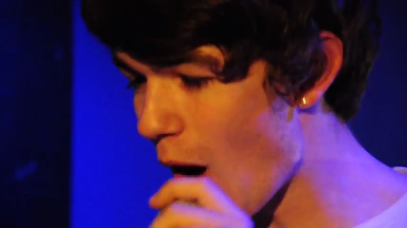 |
| A close-up of the lead singer's fact: a 'meat' shot. |
- The video is primarily concept-based, with an aspect of performance. This makes the video perhaps a bit more enigmatic for the consumer, seeing less of the band performing and more of seemingly random clips.
- The form of a music video is apparent through our use of performance, syncing cuts to the music, ‘meat’ shots used to generate a star image, unclear or incoherent narrative and a variety of camera techniques and movements.
- The video also conforms to the characteristics of it’s genre by emulating the light-hearted tone, using quirkiness and humour and our use of bright colours. Similarly, our use of the camera and editing was conventional in that we included a wide variety of shots and camera movements and included effects such as reversal or time manipulation, which are common in the genre. In questioning whether or not we challenged any conventions of the indie genre, it’s difficult to answer, as the genre is extremely varied in terms of music videos. However, many indie videos have a slightly more linear narrative, allowing the video to feel like a story, and ours was far more conceptual.
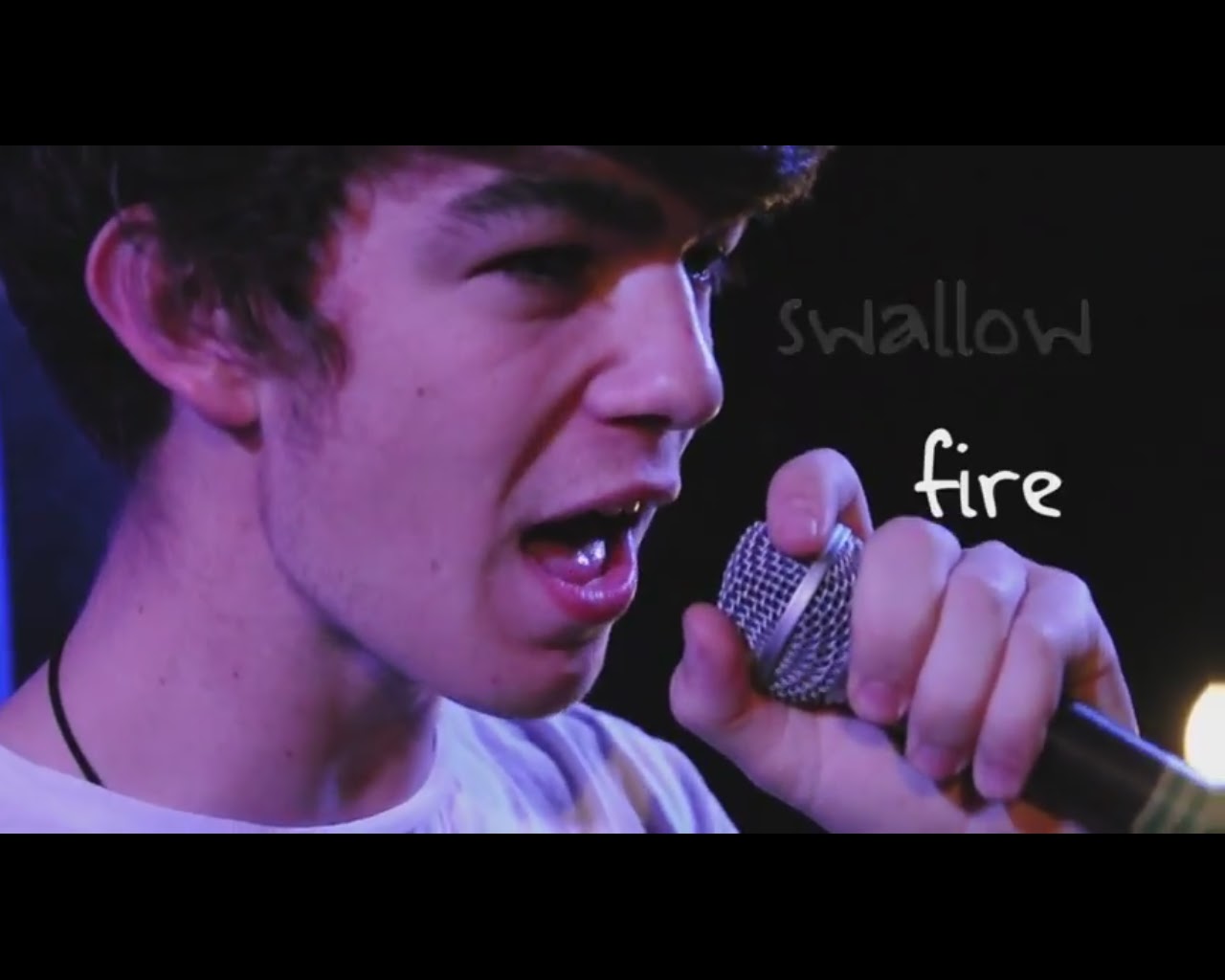
- We also included lyrics which appear onscreen alongside certain lyrics, which is unconventional, but we felt set the performance apart from others, and emphasised certain lines which go along with our themes of youthfulness and energy, such as ‘between the places we messed up’ and ‘swallow fire.
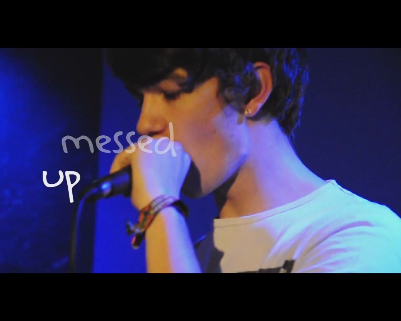 |
| Lyrics being matched with performance. |
- The text could be said to be polysemic in some ways. It promotes the ideas of being youthful, energetic and fun, but simultaneously invokes feelings of longing through the lyrics ‘when you can’t break through with the one that you want’. This ensures that the audience are left wanting to view it again in order to build a coherent picture. Overall, I would suggest that these interpretations come together to promote the idea that being young is about having fun and using your energy, without worrying about relationships or the breakdown thereof.
- Other interpretations suggest that our video is primarily concerned with ideals of friendship and male rebellion. There is plenty of energetic, disobedient action which is portrayed in a happy, light-hearted manner.
- Using semiotics to deconstruct the text, it is clear that bright colours are an important signifier for the values of youthfulness, energy and fun. This connotes a similar meaning associated with the band. The setting also signifies through the vivid colours, outside location and bright lighting a love of fun and harmony with the world.
 |
| Vivid colours and T-shirts emphasise the youthful, energetic nature of the video. |
- By association with coloured T-shirts, which can be said to represent youth, fun, energy and light-heartedness, the band are attributed the myth that they possess these traits and that they are desirable for a teenager.
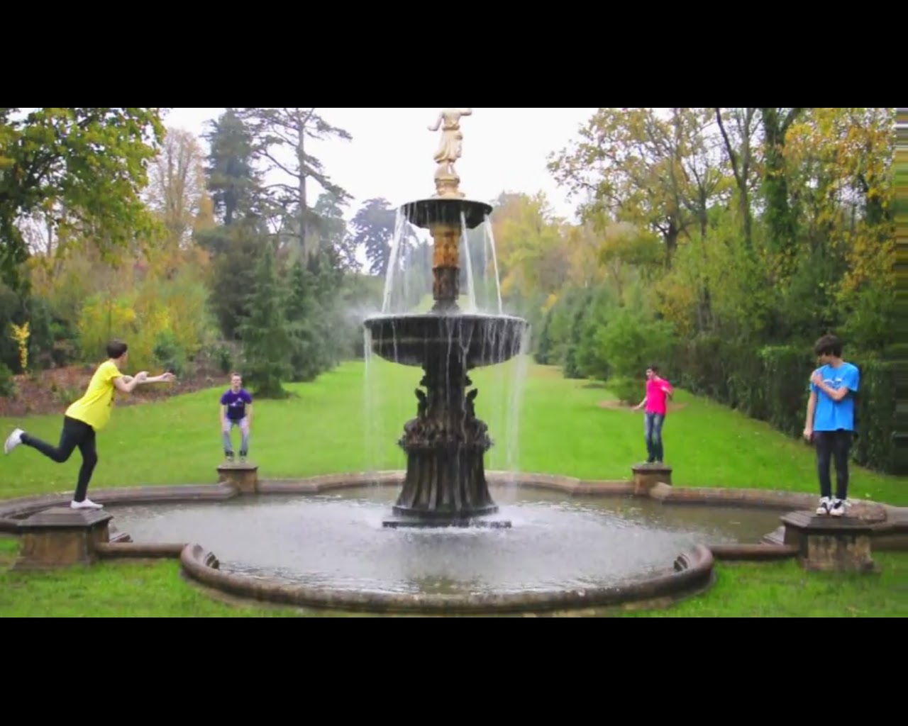
- The video is postmodern in style in that it makes use of parody at times. For example, the video includes the common technique of stop motion in various parts, but parodies this technique by including sections where the stop motion has seemingly ‘messed up’, such as the second time the stair sequence appears, and instead of the final still there is a clip in which one band member has descended onto the wrong stair, to the amusement of the others. This approach is somewhat unconventional of the genre, which in our secondary research we found to not often use parody. However, it is not unheard of, as can be seen in the music video for Pharaohs’ ‘Drift Away’ (Porter, 2011) which mocks the (perhaps overly) energetic and passionate performances that many bands use in their videos by playing in bed, in their underwear and without much apparent effort.
  |
| Left: a still from Pharaoh's 'Drift Away'. Right: a section in our video in which the stop motion seemingly 'messes up'. |
- The video does not feature any females, and so this gender exclusion is the only discernible discourse on gender. This could tie in with our overall meaning for the video, that relationships are not important at a young age; the focus should be on having fun. This is, however a male-centric view.
- In a preferred reading, the video reinforces the dominant ideology that teenagers are rebellious and perhaps immature, but in a positive way. This is done through the use of humorous and light-hearted sequences, and the inclusion of signs such as ‘WET PAINT’ which are purposely disobeyed. However, an oppositional reading might be one of negativity towards the disobedience of today’s youth, together with complaints about their apathy.
Subscribe to:
Posts (Atom)